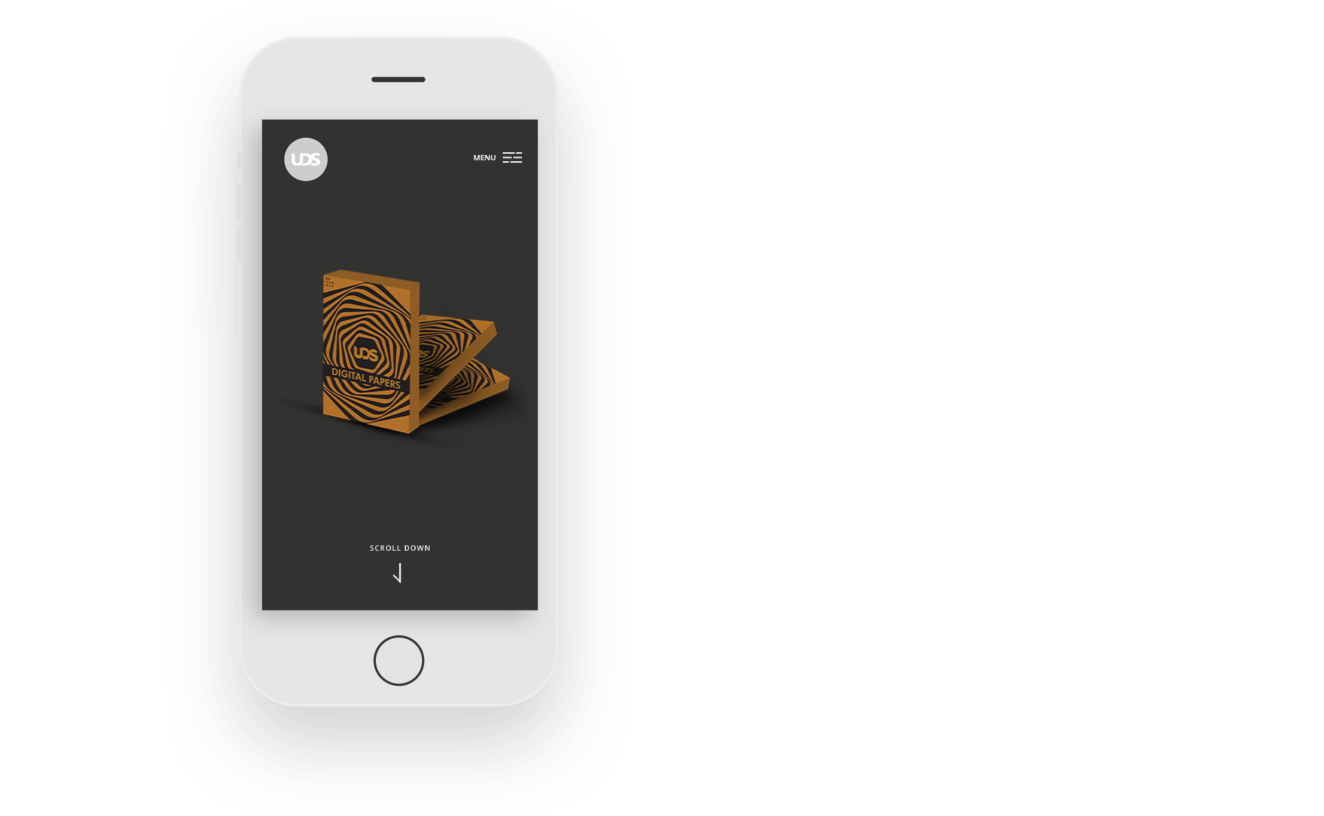
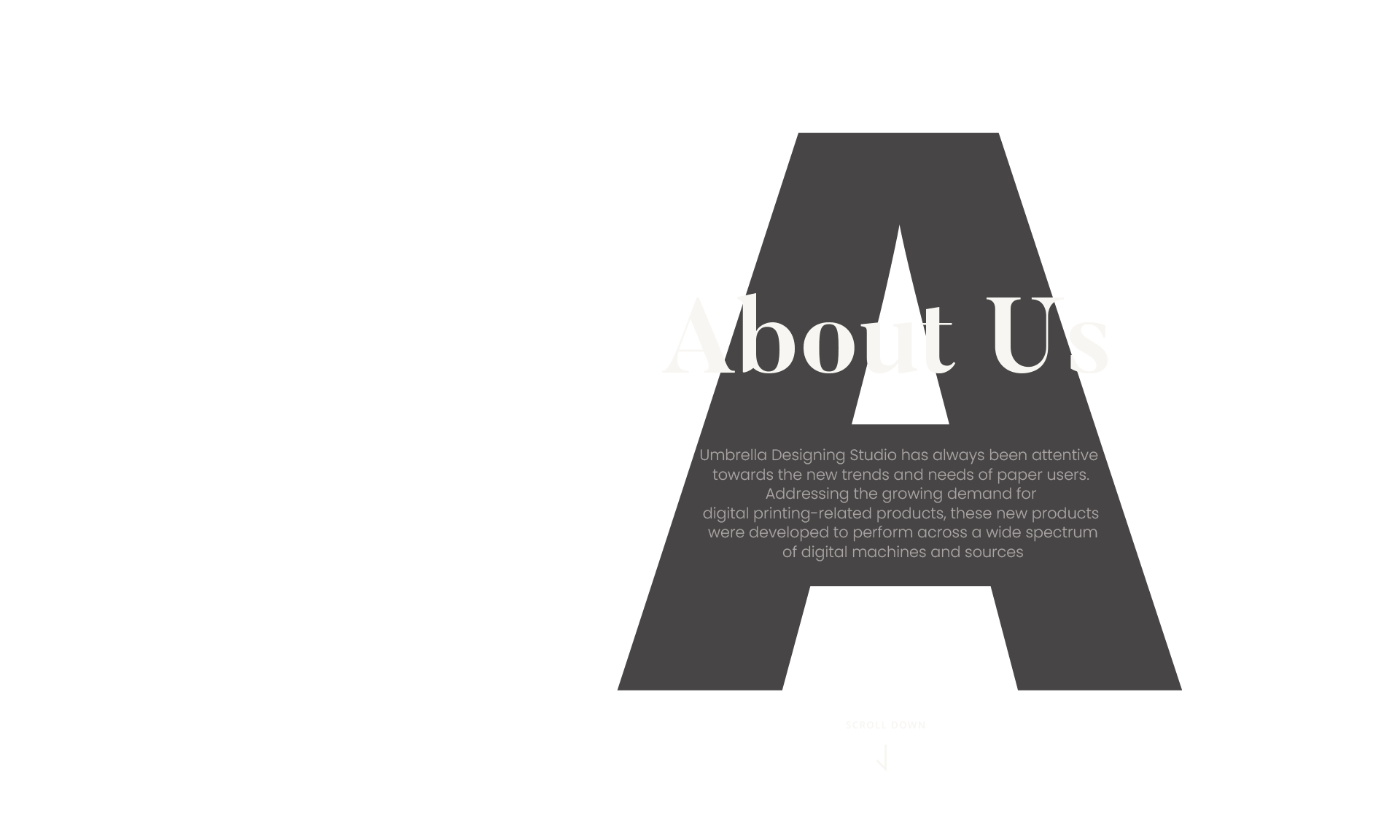
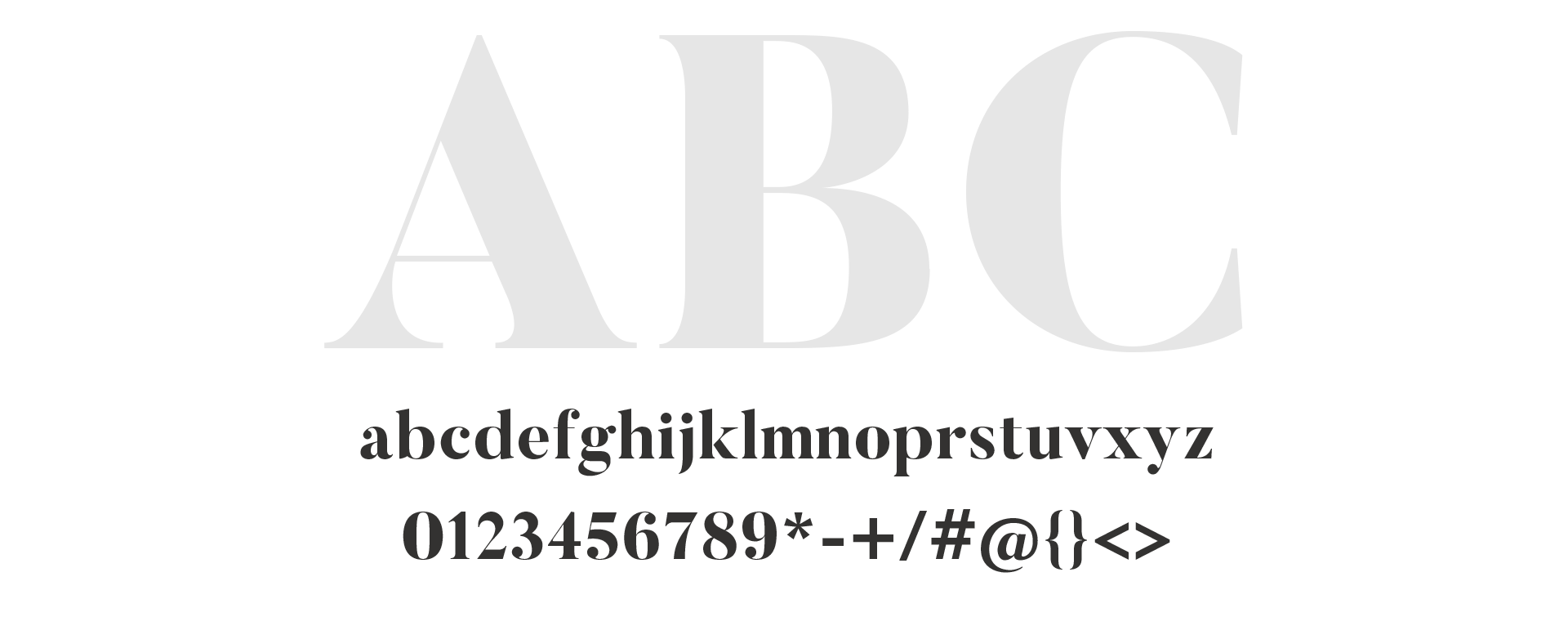
With an assignment to create a minimalist website, we focused on typography and a huge amount of white space, which reinforces the firm’s professionalism. The website had to follow a clean, simple visual style, but we still wanted to add something special that would personify the brand in a unique way. Our solution was to extract the ampersand from the firm’s logo and break it apart in several different combinations, letting its components illustrate the story as you scroll through the homepage. Once the user finishes their journey, the symbol reconnects, completing its journey as well.
